Tools:
Figma
Figjam
Maze
Mural
Optimal WorkshoP
My Responsibilities:
User Research
Wireframing & Prototyping
Usability Test
Timeline:
65 hours
Project Overview
The Problem
Artimelle is a sustainable lab-grown diamond jewellery brand that creates exquisite pieces to inspire and empower individuals.
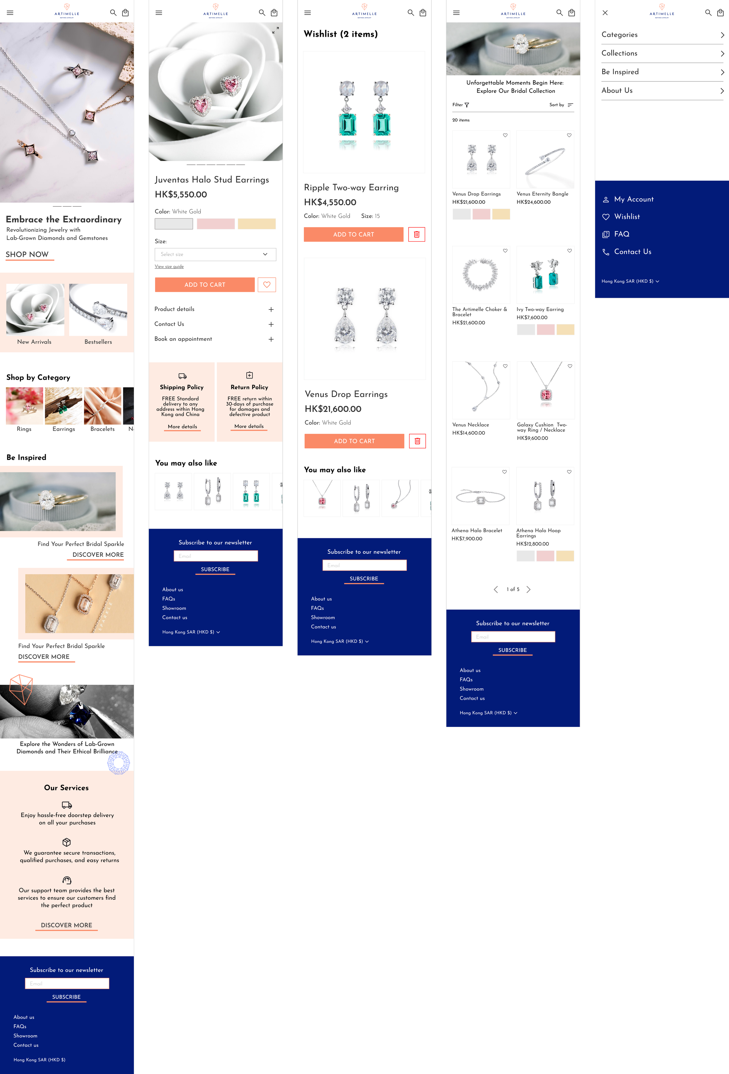
Upon observing Artimelle's website (https://artimelle.com/), We have identified several usability issues that may impact the user experience. These include a lack of clear navigation, unclear content organization, inconsistent currency switching options, and unclear call-to-action on hero banners. These issues might prevent users from easily finding information and navigating the site effectively, which could discourage them from making purchases on the website.
Additionally, there is a need to highlight Artimelle's brand values, which are innovation and trustworthiness, on the website. This will allow the brand to deliver more information to customers and might increase their confidence in making purchases on the website.
The Goal
Our goal is to redesign Artimelle's website to reflect its key brand values. Through enhancements in accessibility and usability, our primary focus is to elevate the overall customer experience by improving the information hierarchy and providing an easy-to-navigate interface. We aim to enhance the customer journey and increase sales made through the website.
The Design Process
01 Research
During this phase, we aimed to understand the target audience's needs and behaviors by studying competitors' sites for best practices and identifying areas for improvement based on user feedback.
02 Define
User personas and journey maps are created to better understand the target audience, while project objectives and goals are clearly outlined to set the direction for the redesign.
03 Design
Wireframes and prototypes are developed to visualize the layout and functionality of the new design, incorporating visual elements, color schemes, and imagery to enhance the user experience.
04 Test
Conducted usability testing with real users to gain valuable feedback and guide iterative improvements to ensure an intuitive and effective user experience.
01 Research
Research goal
We want to understand the experience of users browsing Artimelle's website and identify any challenges and frictions they may encounter. Additionally, we aim to explore the content and information that users would find valuable and interesting, and assess whether it increases their desire to make purchases on the website by effectively demonstrating Artimelle's brand values of innovation and trustworthiness.
To understand how the brand values or information affect users' purchasing desire.
Identify the key content and elements that users find valuable on Artimelle's website.
Gather users’ feedback on the current website to identify challenges and friction points they encountered.
Research Objectives
Methodologies
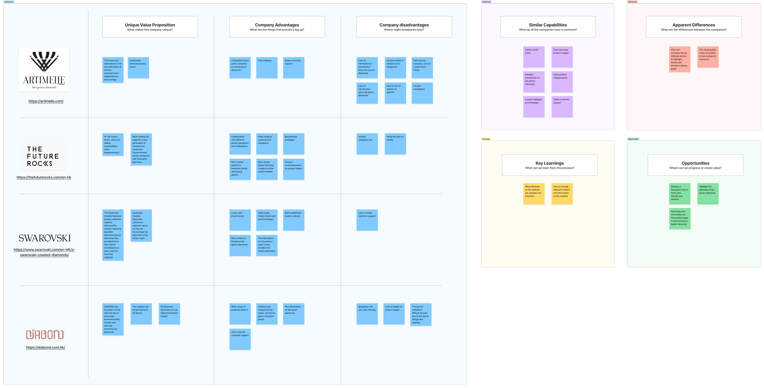
To understand the strengths and weaknesses of competitors, as well as to identify their approaches when addressing similar problems.
Competitor Analysis
Key learnings:
Identifying valuable and essential website elements.
Determining optimal strategies for organizing diverse content and information on the website.
User Interviews
To gain deeper insights into user needs and pain points, follow-up questions were used to validate hypotheses and make any necessary adjustments to the solutions being developed.
During the interviews, participants were asked to present a jewelry website they had visited and illustrate their navigation process. The key findings were as follows:
The navigation bar and menu proved to be the most frequently utilized areas on the jewelry website.
Participants emphasized the significance of a product-focused hero banner on the homepage.
There was a desire for collection introductions and shopping inspirations on the homepage.
The search function was used to locate specific products.
Product images, especially model shots that showcase product details, were considered essential.
Participants were also requested to browse through the Artimelle website and share their opinions.
The following pain points were identified:
Text visibility and readability issues on banners and product pages.
Hero banner visuals were perceived as overwhelming.
Lack of essential information about lab-grown diamonds, stone types, metal materials, laboratory specifics, warranties, and delivery details.
The absence of a dropdown menu, difficulty finding collections, and limited visibility of related products.
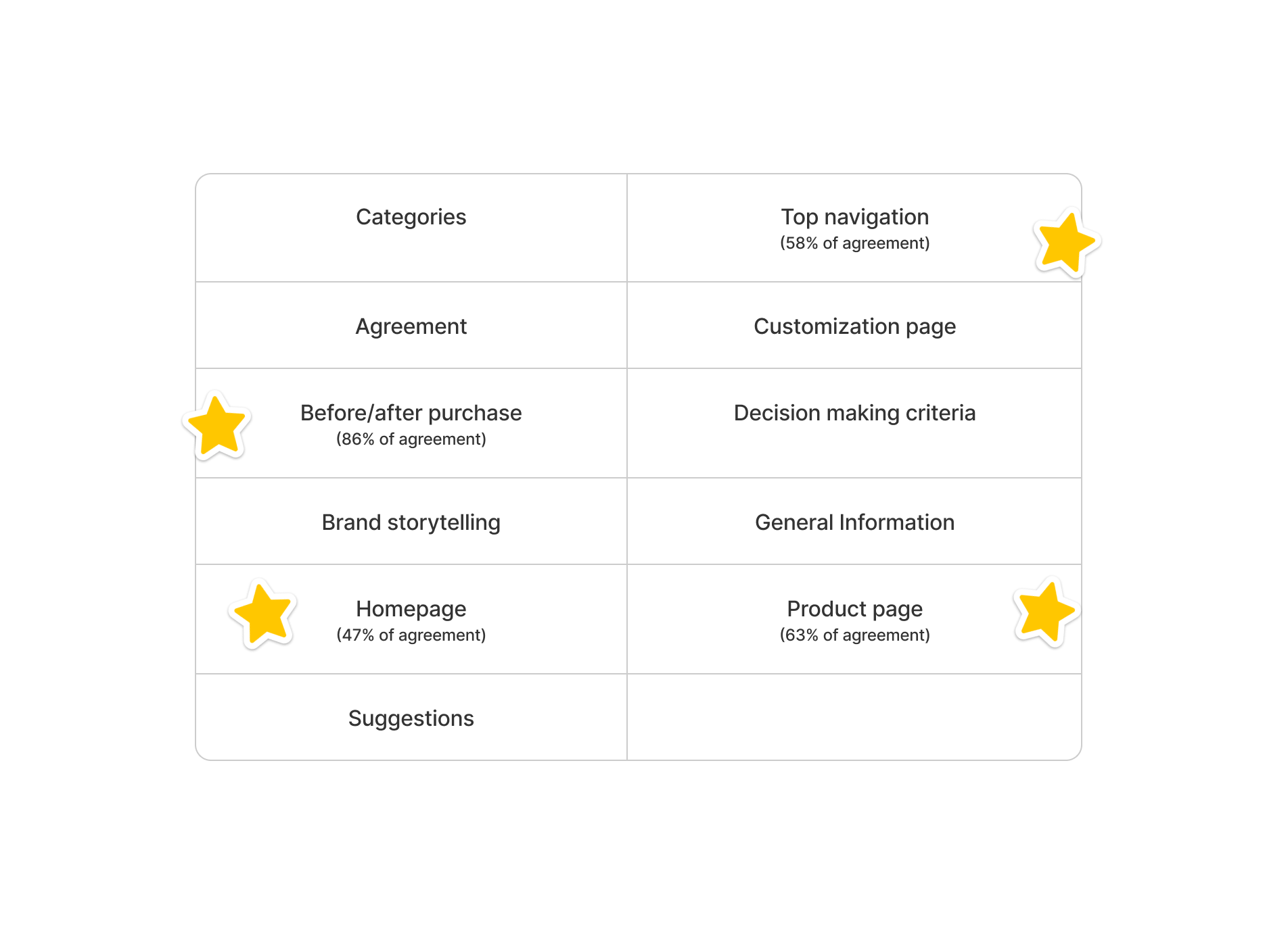
Card Sorting
To obtain a clearer understanding of how to organize the content effectively.
33 cards were provided and 11 categories were created.
Learnings from research
User goals were identified from research findings:
Make informed decisions by accessing clear product information and understanding the transparent shipping and return policy.
Easily explore and navigate through the website to find desired products.
Find inspiration through curated collections on the website.
Build trust on the website to establish confidence in users for making online purchases.
02 Define
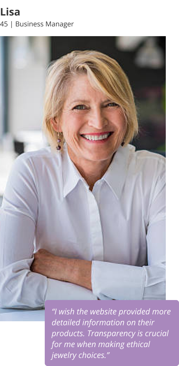
User Personas
We developed user personas to pinpoint user identities. These personas empower us to make more informed decisions throughout the design process, leading to the creation of a more user-centric and effective solution.
Problem statements
Point of view (POV) statements were created to summarize users' needs.
They were then converted into 3 How-Might-We (HMW) questions to encourage divergent thinking:
“How might we create intuitive navigation to enhance the user experience, allowing users to easily find their ideal jewelry pieces on the website?”
“How might we ensure that all information and policies are clear, transparent, and prominently highlighted on the website, so that users can make informed decisions when deciding on a purchase?”
“How might we enhance the trustworthiness of the website, so that users feel confident placing an order?"
Project Goals
Project objectives and goals are clearly outlined to guide the redesign process. With well-defined project goals, we can effectively prioritize tasks, allocate resources efficiently, measure progress accurately, and deliver a successful redesign that aligns with both user needs and business objectives.
Sitemap
A sitemap was created based on research findings, user personas, problem statements and project goals to visualize the pages and screens that will be included in the app.
User Flows
2 user flows were created to translate users' needs and goals into steps within the app. These flows focus on product discovery and inspiration, providing key insights for designing a user-centric website that can enhance user engagement and conversion rates.
User Flow 2: Look for gift inspirations and add products to wishlist
User Flow 1: Find a product from navigation bar and add to cart
03 Design
Wireframing
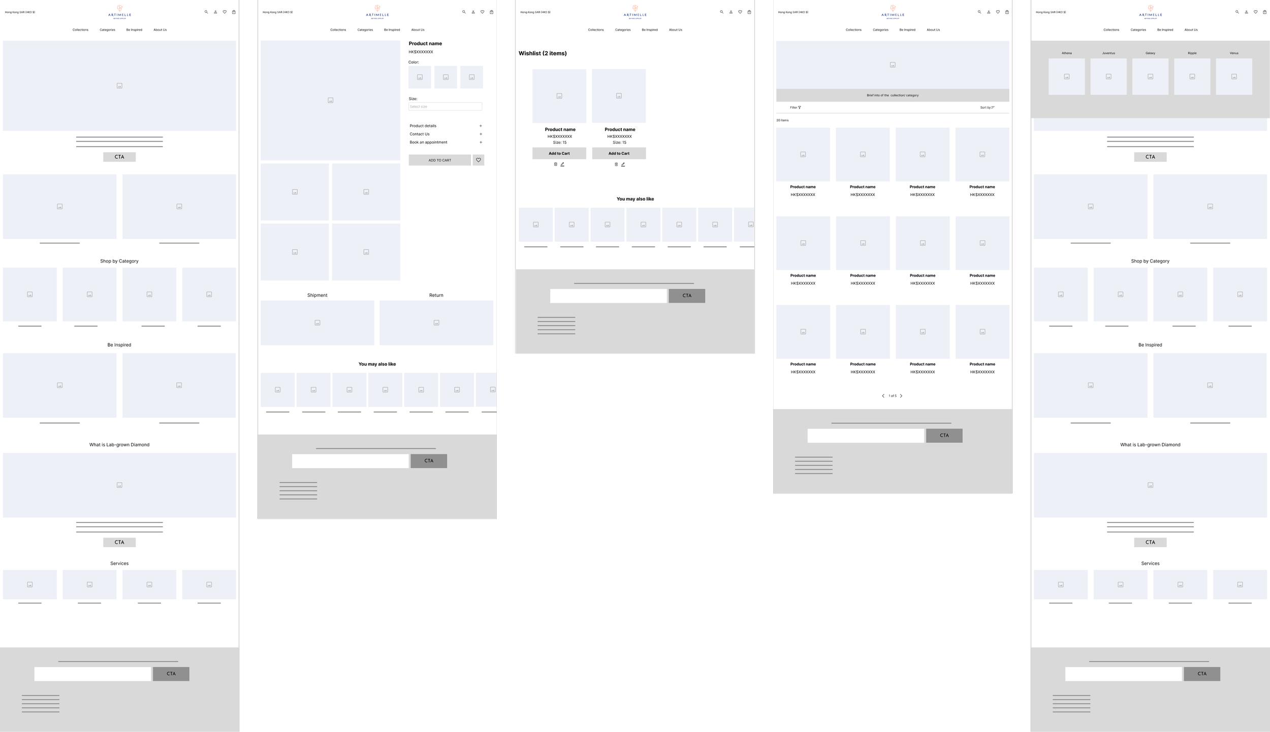
Low-fidelity wireframes were created using user and task flows as a foundation, offering a quick and effective way to visualize and refine design ideas, with a focus on the general structure and functionality.
Low-fidelity wireframes - Mobile
High-fidelity wireframes - Mobile
Low-fidelity wireframes - Desktop
An unmoderated user test was conducted in Maze with 5 participants on the low-fidelity wireframes. The following suggestions were received:
Add a heart icon overlay on product images in the listing page to allow users to add items to their wishlist directly from the image, without needing to click for more information.
Implement a visual indicator to display the number of items in the shopping cart, enabling users to see the count without having to navigate into the cart, allowing users to continue exploring and making additional purchases without interrupting their flow.
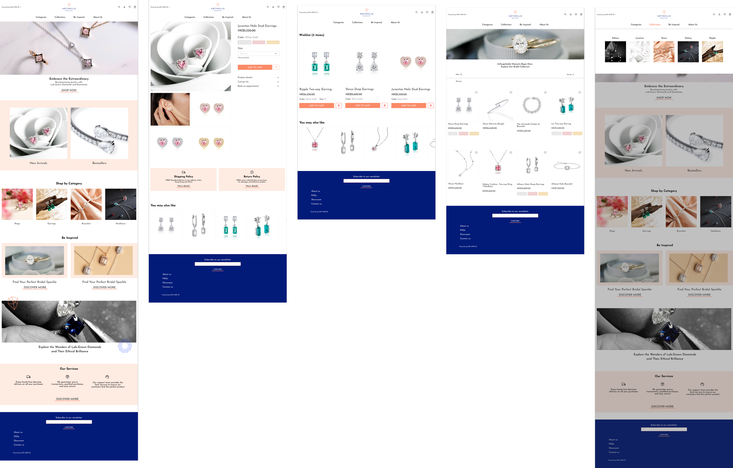
High-fidelity wireframes were created based on Artimelle’s color palettes and UI elements. By incorporating detailed design elements, these wireframes offer a realistic preview of the user experience, allowing for more accurate feedback and validation of design decisions.
High-fidelity wireframes - Desktop
04 Test
What worked?
The website was easy to navigate.
UI designs were clear and clean.
Error messages were effective.
To validate our design choices, an unmoderated usability test was conducted with 5 participants on the mobile wireframes.
What can be improved?
Lack of a back button on the navigation.
Uncertainty in locating the wishlist.
Enable users to add products to the wishlist without selecting color/size.
Iterations were done according to usability test findings.
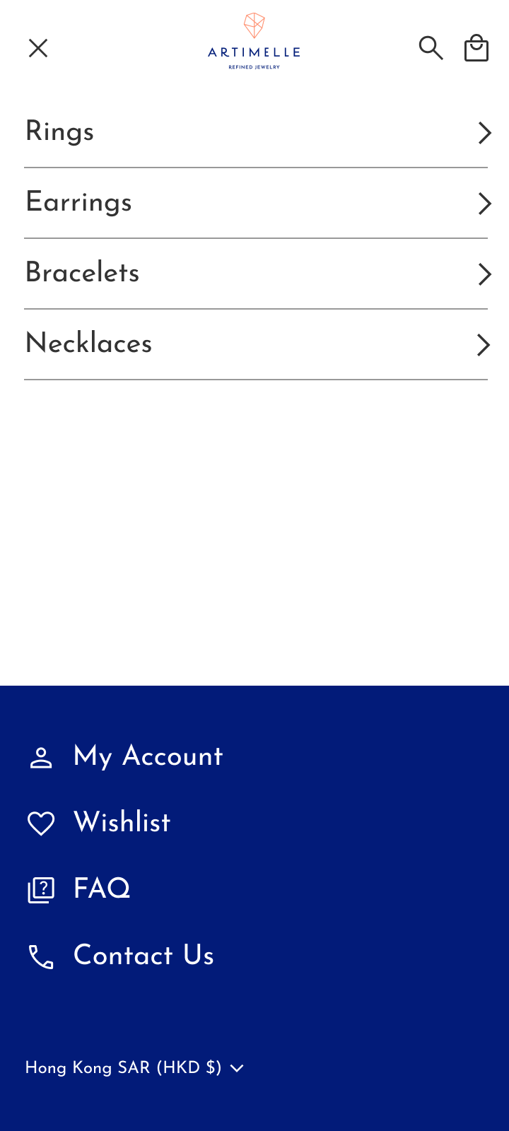
01. Add a back button to the navigation menu:
Some participants mentioned that they couldn't find a button to navigate back to the previous level of the menu after selecting an option. Adding a back button would enable users to easily return to the previous page.
Before
After
02. Increase the prominence of the wishlist icon:
Several participants expressed difficulty in locating the wishlist page. Enhancing the visibility of the icon by adding it to the header would assist users in quickly accessing and reviewing their wishlist items.
Before
After
03. Enable adding products to the wishlist without selecting specifications:
Participants noted that they typically do not need to select specifications when adding a product to their wishlist. Allowing users to specifying details on wishlist page instead of product page would streamline the process and make it more user-friendly.
Before
After
Final Prototype
To demonstrate user interactions across screens.
My Learnings
Hone skills in effective client communication and understanding unique needs.
Gain experience in balancing constraints such as branding and visuals while redesigning based on business and user goals.
Enhance the ability to organize content logically and in a user-friendly manner to drive sales through the website.
Deepen understanding of the importance of prioritizing usability and accessibility for a seamless user experience.
Ensure that design solutions align with identified user needs through problem statements and consistent reference to user goals.
Prioritize key screens over additional screen redesigns due to time constraints.

